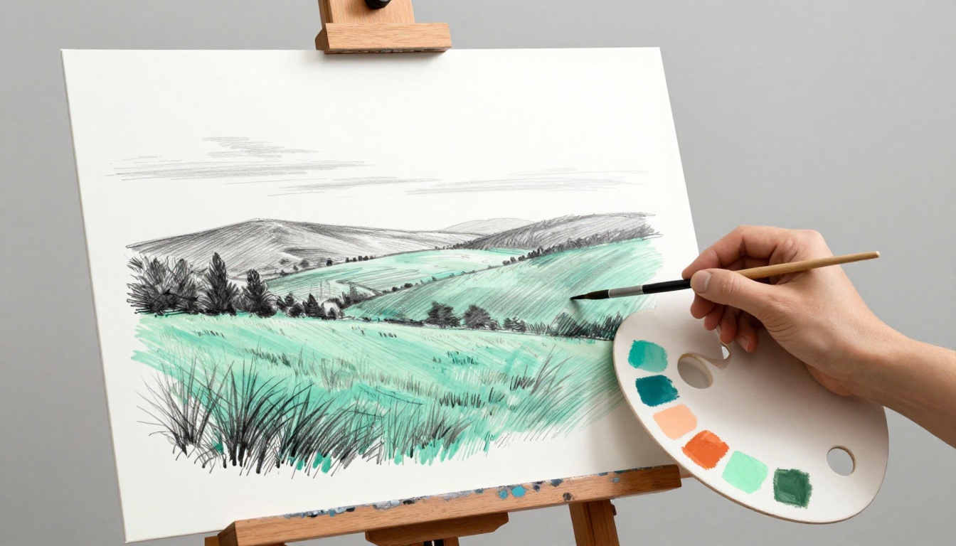
Imagine a basic landscape painting that grabs everyone’s eye at a 2026 gallery show. The artist swapped dull greens for Transformative Teal, a rich blue-green shade from trend experts at WGSN. Suddenly, it feels fresh and eco-inspired, drawing crowds who can’t look away.
Colors do more than fill space in your artwork. They set the mood, snag attention, and build real connections with viewers. Right now in March 2026, folks mix earthy tones like moss green and terracotta orange with bold pops of acid green or electric pastels. This balance creates grounded yet exciting pieces in paintings, digital art, and illustrations.
You might stare at your canvas, unsure which shades match your vision. Colors clash, or they fall flat against the latest vibes. But you don’t need to guess anymore.
We’ll cover color theory basics, viewer psychology, hot 2026 trends, handy tools, and pitfalls to skip. Follow these steps, and you’ll pick colors that fit your idea perfectly while wowing your audience. Let’s dive into the first key: understanding color theory foundations.
Build a Strong Foundation with Color Theory Basics
You start with the color wheel. It arranges hues in a circle based on how they mix. Primaries like red, blue, and yellow form the base; no other colors make them. Secondaries come next: orange from red plus yellow, green from blue plus yellow, purple from red plus blue. Tertiaries fill the gaps, such as red-orange or blue-green.
This simple tool guides your choices. For example, check out this basic color wheel guide for artists to see the relationships up close.
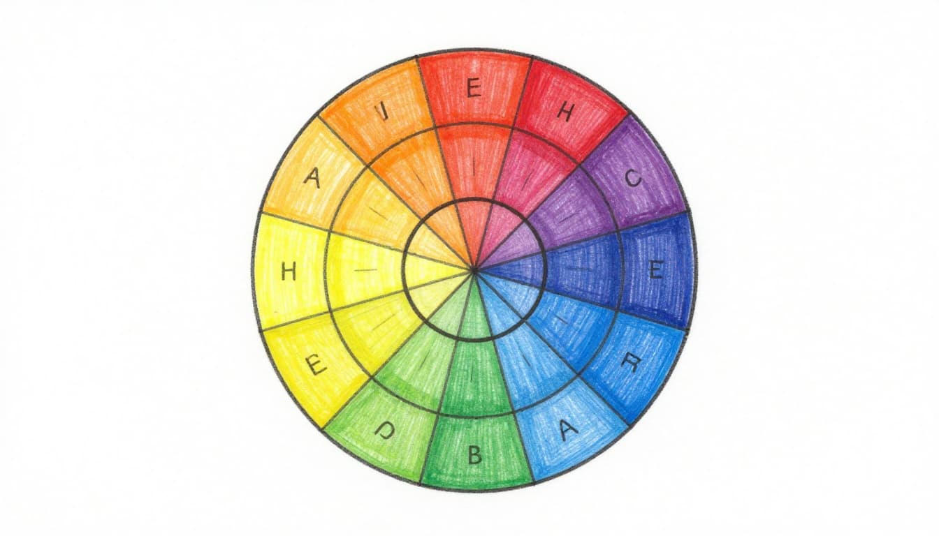
Warm colors sit on one side: reds, oranges, and yellows. They feel exciting and pull viewers close, like a sunset’s glow. Cool colors oppose them: blues, greens, and purples. These soothe and seem distant, much like an ocean horizon. Start your palettes with just four or five shades from the wheel. Pick one main hue, add a warm accent, a cool balance, and neutrals for depth. This keeps your artwork focused yet lively.
How Complementary Colors Create Pop and Drama
Complementary colors sit opposite each other on the wheel. They boost contrast when you place them side by side. Think red versus green, or blue against orange. This pairing makes each shade vibrate and stand out.
Artists love them for drama. In paintings, a slash of Transformative Teal against warm terracotta pulls the eye right to the focal point. Digital pieces gain punch too; elements pop without overwhelming the scene. For 2026, try clay red next to neon aqua. It gives a tactile, almost textured feel, perfect for bold abstracts or product illustrations.
Because opposites intensify each other, use them sparingly. A single complementary accent on a neutral base creates focus. See these striking examples of complementary colors in art for real inspiration. Your viewers will feel the energy.
Why Analogous Colors Bring Calm Harmony
Analogous colors cluster next to each other on the wheel. They blend smoothly because they share similar undertones. Sage green beside ochre works great for landscapes; the shift feels natural, like rolling hills at dusk.
In abstracts or wellness art, they unify the canvas. Moss green flows into terracotta orange without jarring edges. This harmony calms the mind and invites long gazes. Meanwhile, it supports subtle emotions, ideal for serene scenes.
To build one, grab three adjacent hues and tweak saturation. Add a touch of complementary for interest if needed. Landscapes thrive here; the colors mimic nature’s easy transitions. Check this guide on using analogous colors for harmony to refine your approach. You’ll craft pieces that soothe in today’s fast world.
Use Color Psychology to Spark the Right Emotions
Colors hit us on a deep level. They stir feelings before we even notice. In 2026, savvy artists pick shades that match their message. Earthy tones ground viewers in calm. Transformative Teal brings fresh balance. You can do the same. Match colors to your artwork’s goal, like soothing wellness pieces or energetic illustrations. Let’s break it down.
Earthy Tones for Grounded, Honest Feels
Ochre, clay red, and moss green pull from the soil itself. They whisper stability and truth. Viewers relax because these shades mimic nature’s quiet strength. Sage green adds soft calm; cocoa powder brings warm comfort. Perfect for wellness abstracts right now.
Think rolling hills or textured abstracts. These tones ease stress and connect us to the earth. Artists blend them for biophilic designs that feel restorative. In short, they ground chaotic minds.
For example, ochre hills fade into mossy patches. Clay red rocks add honest weight. The result? A scene that invites peace.
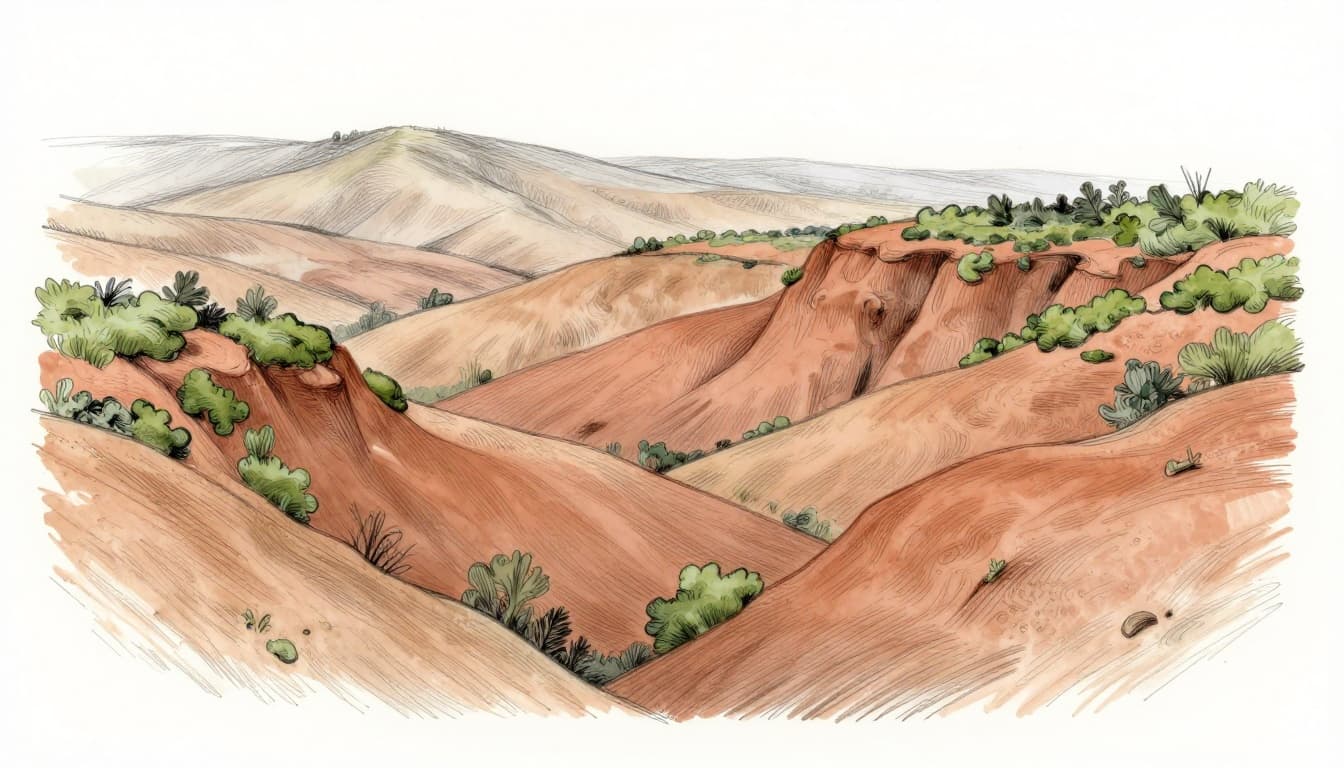
See how earthy palettes create soulful 2026 art. They suit moody landscapes or honest portraits. Pair sage with cocoa for extra depth. Your viewers will linger.
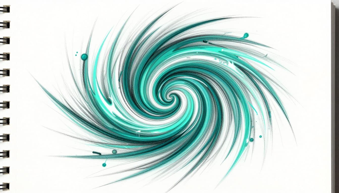
Bold Pops Like Transformative Teal for Fresh Energy
Transformative Teal stands out as the 2026 Color of the Year. This deep blue-green blends eco-balance with renewal. It sparks change without overwhelming. Pair it with electric accents for modern heritage vibes.
Teal flows like a river through heritage patterns. It energizes yet soothes. Add neon aqua or electric coral nearby. The contrast wakes up old styles. Great for uplifting illustrations.
Meanwhile, bold yellows jolt attention. Acid greens add playful punch. Use them sparingly around teal. Cool blues or plum noir temper the energy for serenity.
Check why Transformative Teal transforms art and design. It fits eco-art or dynamic scenes. Balance it right, and your piece pulses with life.
Dive into 2026’s Top Color Palettes for Inspiration
Artists turn to fresh palettes each year for that spark. In 2026, trends mix nature’s calm with urban energy. Pinterest data shows persimmon searches up 100%, while WGSN pushes earthy warmth alongside bold accents. These combos suit landscapes, illustrations, and street art perfectly.
Start with balance: aim for 70% calm tones and 30% bold pops. Adapt to seasons too. Go vibrant with neons in spring and summer; shift to earthies for fall and winter. Check your style on Pinterest boards for quick wins.
Here are key palettes pulling from Pantone and expert picks:
| Palette Name | Core Shades | Best For |
|---|---|---|
| Earthy Naturals | Sage green, clay red, moss, cocoa, ochre | Balanced landscapes, grounded abstracts |
| Cosmic & Teal | Transformative Teal, cosmic blues | Eco-inspired scenes, dreamy illustrations |
| Electric Pops | Neon aqua, electric coral, bold yellows, acid green | Eye-grabbing street art, digital buzz |
| Warm Accents | Persimmon, lava falls orange | Energy boosts in any piece |
| Hybrid Mixes | Earth tones + neons | Versatile all-season work |
These build on color theory basics. They spark emotions while fitting modern tastes. Now, let’s explore two standouts.
Earthy Naturals: Your Go-To for Balanced Landscapes
Sage green grounds your scenes first. It mimics soft fields under overcast skies. Add clay red for warm rock faces; it adds honest depth without overwhelming. Moss brings textured foregrounds to life, while cocoa shades tree trunks richly. Ochre ties it all with golden highlights, like late sun on hills.
Experts call this palette ideal for grounded pieces. It evokes stability, perfect for wellness art or biophilic designs. Layer sage over ochre bases for smooth transitions. In contrast, cocoa tempers brighter spots. Results feel restorative, much like a quiet hike.
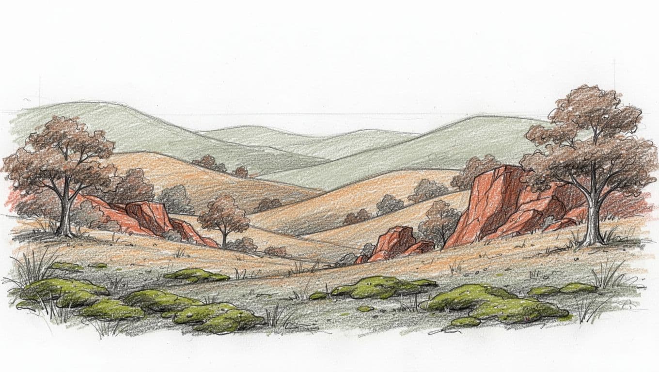
See how earthy tones create soulful 2026 landscapes. Blend them 70-30 with a teal accent for extra pop. Your viewers relax right away.
Electric Pops: Add Digital Buzz to Street Art
Neon aqua hits walls with fresh glow. It screams urban energy, ideal for graffiti flows. Electric coral adds fiery edges; pair it on highlights for instant drama. Bold yellows jolt key spots, grabbing eyes from blocks away. Meanwhile, acid green weaves through for playful contrast.
This mix suits illustrations that grab eyes. Street artists use it to blend digital vibes with real grit. Start with aqua bases, then layer coral bursts. Yellow accents pull focus; green softens harsh lines. The result pulses like city nights.
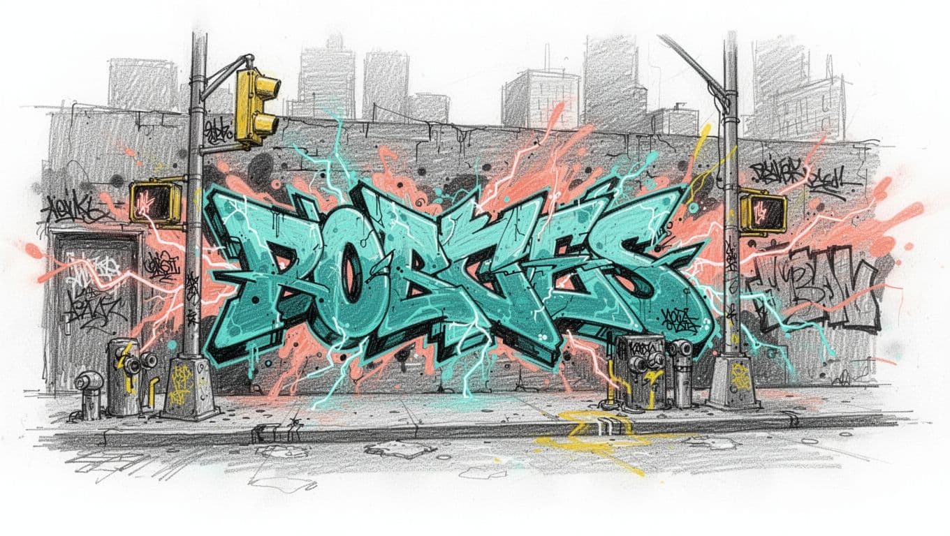
For more on neon palettes in 2026 street trends, test small sketches first. Balance with 70% neutrals so it doesn’t clash. Your pieces stand out in galleries or online feeds.
Pick Colors Like a Pro with These Handy Tools
You know those 2026 palettes now. But how do you generate your own fast? Tools make it simple. They handle the math behind harmonies so you focus on creating. Start with free apps or software you already use. Then layer in trends from pros like Pantone and WGSN. Best part? You test everything on quick sketches before committing.
Grab your tablet or phone. These picks save hours and spark ideas that fit earthy naturals or electric pops perfectly.

Free Apps That Spin Palettes Instantly
Coolors grabs a photo of soil or sky. It spits out palettes in seconds. You tap a base like Transformative Teal. The app suggests complements or analogs right away. No fuss. Export hex codes for your software. Because it runs in browsers, you access it anywhere.
Adobe Color works the same way. Pick a hue on its wheel. Choose harmony rules like triadic or split-complementary. It auto-fills the set. For example, start with clay red. You get moss green and ochre matches instantly. Save to Creative Cloud for Photoshop later. Both apps update for 2026 trends, so earthy mixes pop up first.
Here is how you use them step by step:
- Open Coolors or Adobe Color.
- Upload a sky photo for cool tones. Or try soil shots for earthies.
- Lock your favorite shade. Generate variations.
- Adjust saturation. Preview on a mock canvas.
These tools nail harmonies fast. Meanwhile, they let you mix neons with neutrals easily. Test the results on paper sketches next. Preview under different lights too. Your palettes will hold up in any gallery or online post.
Software like free Krita adds eyedroppers for precision. Procreate on iPad builds harmonies with one swipe. Check Procreate’s harmony panel for quick sets. Pull Pantone’s Cloud Dancer or WGSN’s Transformative Teal straight in. Start small. Build from there.
Dodge These Common Mistakes for Flawless Results
You’ve got palettes and tools ready. Still, simple slips derail even strong pieces. Artists often overload with hues or skip harmony checks. These errors make work feel flat or chaotic. In 2026, dodge them to nail earthy tones like sage green or bold teals. Your art will shine instead.
Limit Colors to 3-5 for Clean Focus
Too many shades clutter your canvas. Eyes bounce around without settling. Stick to 3-5 core colors instead. Follow the 60-30-10 rule: one main hue covers 60%, a secondary fills 30%, and an accent pops at 10%. Add tints or shades of those for variety.
This keeps things sharp. For example, base earthy landscapes in sage green. Layer clay red at 30%. Dot ochre highlights last. Chaos turns to calm.
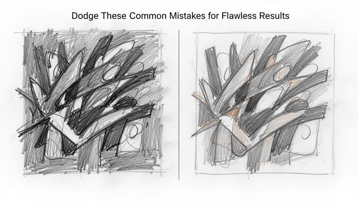
See common color theory mistakes like overusing hues for more fixes. Your pieces gain punch right away.
Temper Bold Sats with Neutrals for Balance
Saturated colors thrill at first. But all-neon or acid green floods overwhelm viewers. They tire fast. Use brights as accents only, around 10-20% max. Pair with neutrals like moss or cocoa for breath.
Softer mixes look premium anyway. Neon aqua works in street art pops. Yet sage grounds it. Balance prevents flat vibes, even in trends.
Test ratios first. Digital previews show issues quick. Adjust before paint hits canvas.
Match Hues to Harmony Rules Always
Random picks clash hard. Red next to neon green jars. Always start with wheel rules: analogous for calm, complementary for pop. Ignore them, and pieces unbalance.
Pick your base, like Transformative Teal. Find analogs nearby. Or grab one complement sparingly. This builds flow naturally.
In short, harmony guides every choice. Your art connects deeper because of it.
Test in Real Light and Your Medium
Colors shift under lights. Morning sun warms ochre; gallery spots cool it. Skip tests, and mud results. Swatch large on your medium first. Paper soaks different than canvas.
Digital? Export and view on multiple screens. Adapt to skin tones too, if portraits call. Acid green suits big walls, not small prints.
Olive et Oriel prints nail this. They test palettes across formats. Match their care. Flawless results follow.
Skip Blind Trend Chasing
Everyone loves 2026 teals. But all-neons flatten heritage scenes. Trends fit your style, not rule it. Wrong context kills: electric coral overwhelms calm wellness art.
Pick what serves your vision. Blend earthies with one pop. Test digitally first. Adapt as needed.
Your work stays timeless this way. Viewers notice the thought.
Conclusion
You now grasp color theory basics, psychology impacts, 2026 palettes, pro tools, and mistakes to dodge. These steps let you build focused pieces that stir real emotions. Most importantly, earthy tones like sage green pair with Transformative Teal for timeless appeal.
Test a sage or teal palette on your next sketch today. Balance 70% calm shades with 30% bold pops, just like the pros do. Your artwork gains that fresh edge right away.
Grab your canvas now. Share your color experiment in the comments below. What palette turns your good art unforgettable?