Ever notice how a bright red sale sign stops you in your tracks? Or why a blue room feels so restful after a long day? Colors shape our moods and choices every day, often without us realizing it.
Color theory gives you the tools to understand and use those effects on purpose. It acts as a simple guide to mixing colors, matching them, and picking ones that create the look or feeling you want. Beginners in art, design, fashion, or home decor benefit most because it turns guesswork into smart choices. No prior skills needed; anyone can start.
This post breaks it down step by step. You’ll learn the color wheel basics, proven harmonies for great combos, how colors stir emotions, real-world uses, and traps to skip. Ready to see colors in a new way and boost your projects?
Unlock the Color Wheel: The Heart of Color Basics
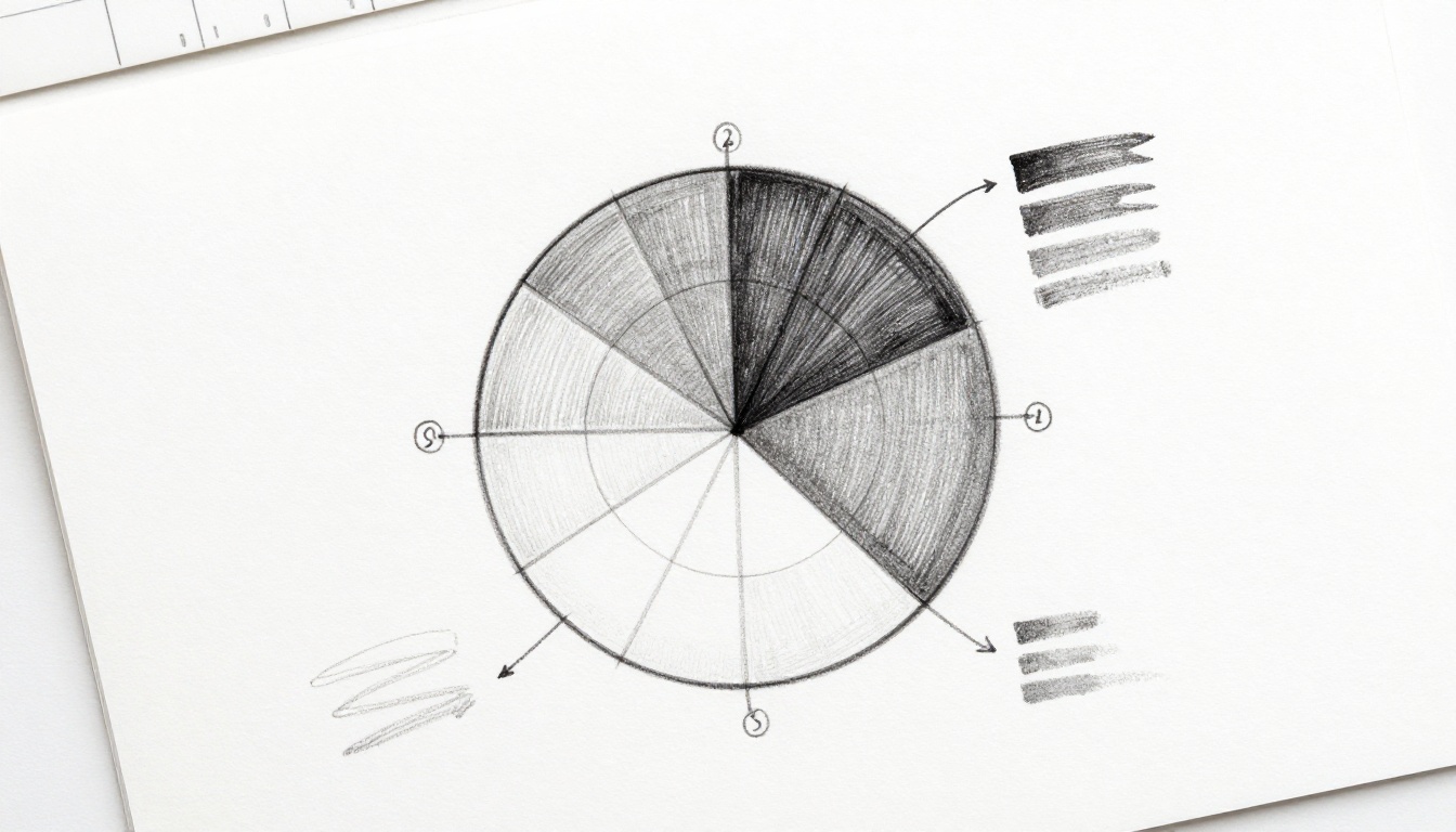
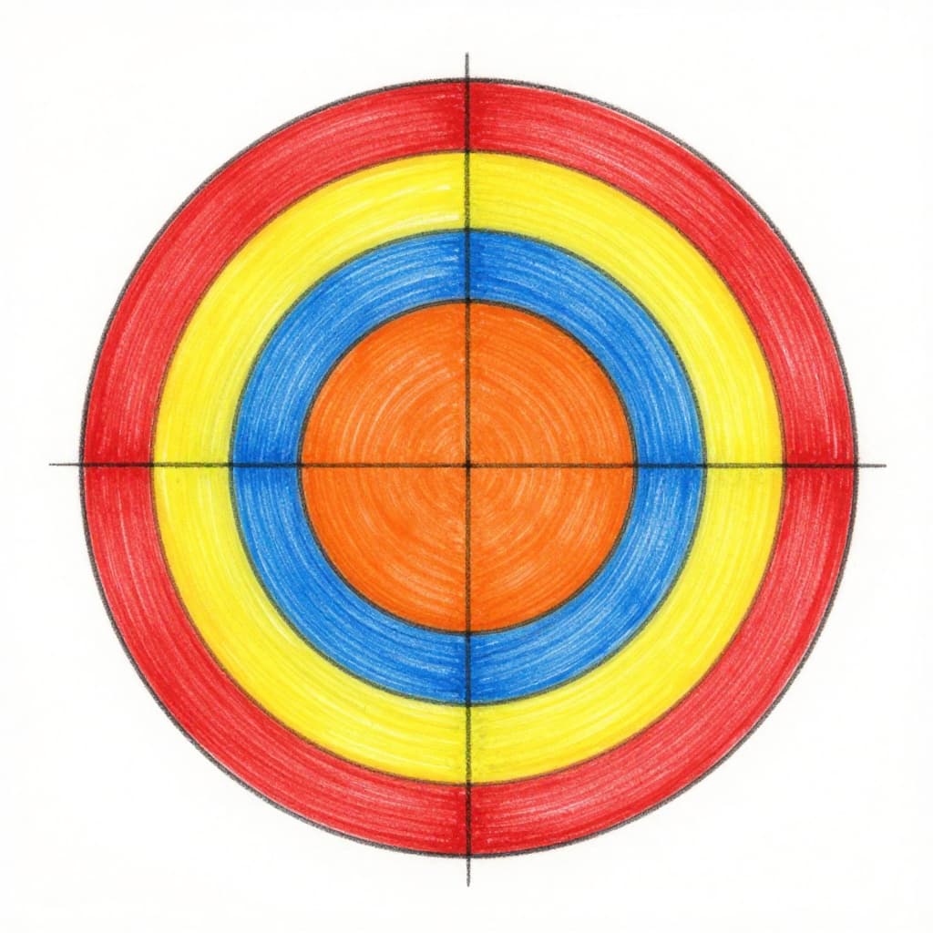
Isaac Newton invented the color wheel in 1666. He arranged colors in a circle to show their relationships. This tool sits at the center of color theory. It helps beginners pick and mix hues with confidence.
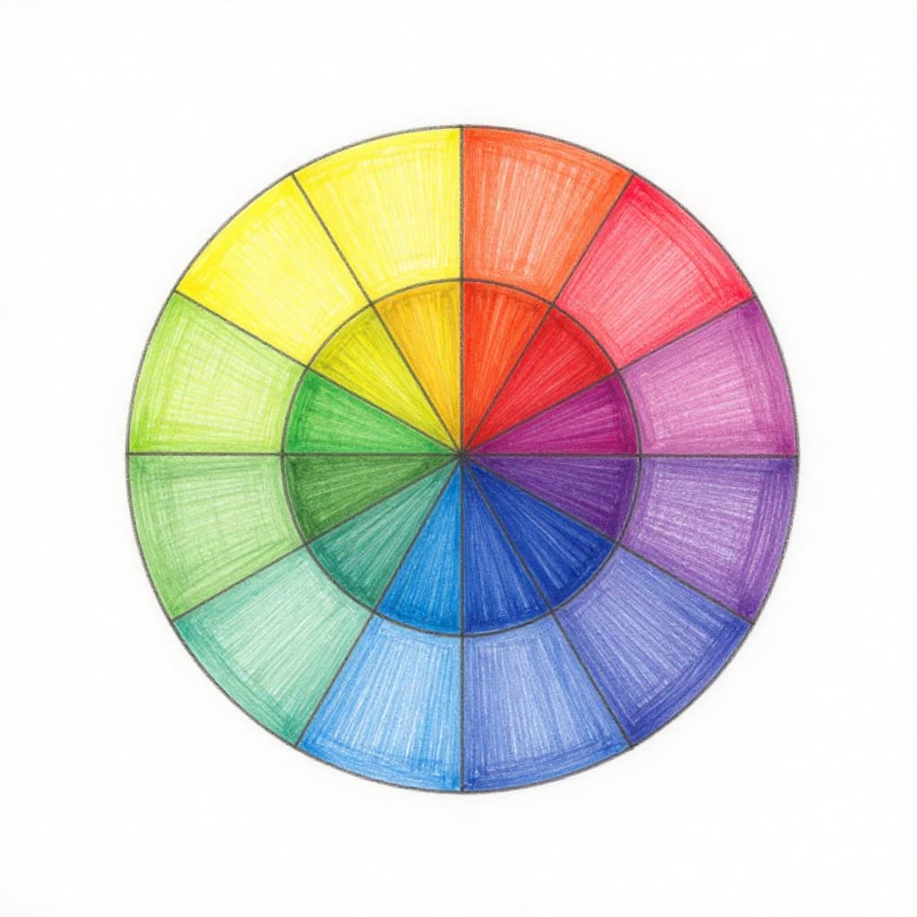
Primary colors form the base: red, yellow, and blue. You mix all other colors from these three. No combination makes them. They anchor everything else on the wheel.
Hue means the pure color itself, like straight red. Add white for a tint; it gets lighter. Mix in black for a shade; that darkens it. Gray creates a tone, which mutes the hue. Value tracks lightness or darkness across them all.
Practice with a free online tool. Search for an interactive color wheel, and spin it to see connections. Beginners notice quick wins in their choices. For basics on mixing, check this complete guide to the color wheel for beginners.
Primary Colors: Start Here with the Essentials
Red, yellow, and blue stand as primaries. Artists mix others from them, but these stay pure. Yellow plus blue makes green, for example. Red and yellow blend into orange.
Knowing primaries stops random grabs. You build a strong base first. Then everything flows from there. This simple step prevents muddy results later.
Secondary and Tertiary: Blending for More Options
Mix two primaries for secondaries: orange, green, purple. They sit between primaries on the wheel. Tertiaries fill the gaps, like red-orange or blue-green. Equal parts primary and secondary create them.
These blends offer variety. The wheel now feels full. You gain options without chaos. Experiment on paper to see how they shift.
Warm and Cool Colors: Energize or Relax Your Designs
Warm colors cluster on one side: reds, oranges, yellows. They spark energy. Think fire or sunsets. Cool colors oppose them: blues, greens, purples. They soothe, like sky or sea.
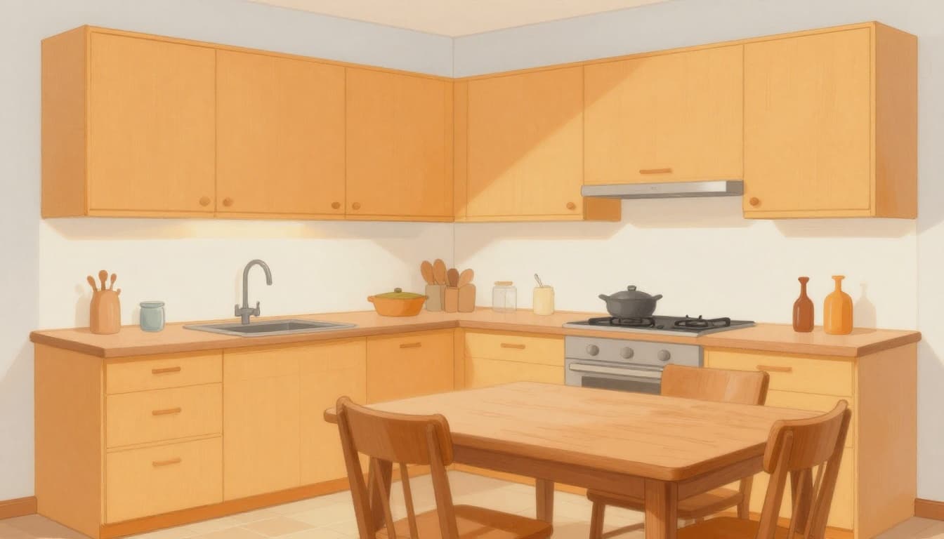
Use warms in kitchens for lively vibes. Go cool in bedrooms to unwind. This split guides your picks fast.
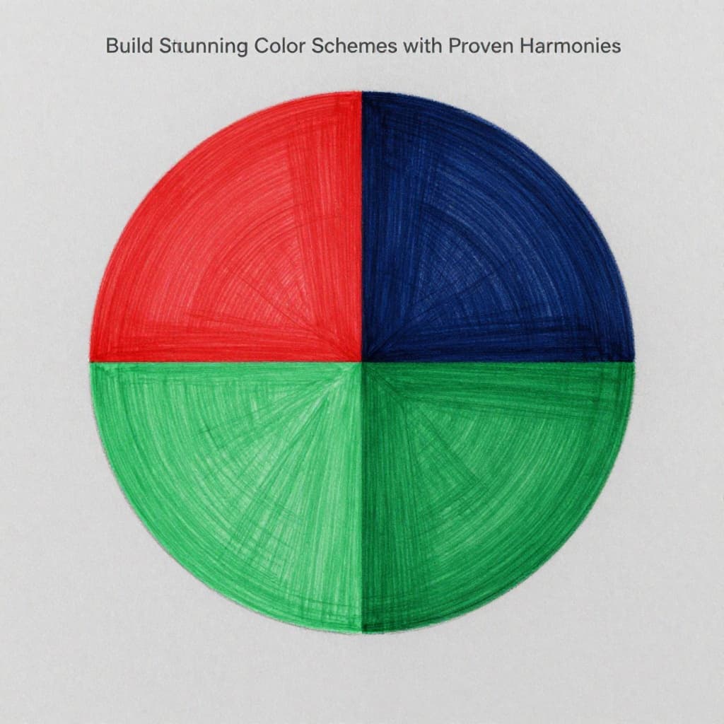
Build Stunning Color Schemes with Proven Harmonies
Harmonies provide safe ways to combine colors. They avoid clashes and build appeal. Stick to three to five colors per project. Each type sets a mood.
Test digitally first with apps. See results without commitment. Real examples show their power in action.
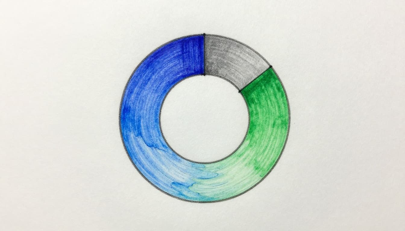
Analogous Colors: Flowing Side-by-Side Harmony
Grab three neighbors on the wheel, like blue, blue-green, green. They flow smooth together. Ocean scenes use this for peace. It creates calm, unified looks.
Complementary Colors: Opposite Forces for High Drama
Opposites pull focus: red faces green. They contrast strong. Make one dominant to balance. Logos pop with this punch. For principles and examples, see color harmony in design.
Triadic Colors: Evenly Spaced for Vibrant Balance
Space three hues equal apart, like red, yellow, blue. They energize yet balance. Posters thrive here. Equal use keeps it lively.
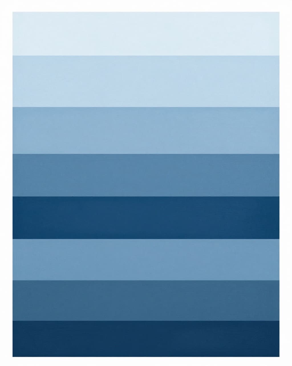
Monochromatic Schemes: One Color, Tons of Variety
Pick one hue, vary tints, shades, tones. Blues from sky light to ocean deep unify spaces. It feels cohesive and sophisticated.
Tap into Color Psychology: Make Colors Speak to Emotions
Colors trigger feelings, but context matters. Culture shifts meanings too. Red signals energy or excitement. It grabs attention fast.
Blue builds trust and calm. Banks pick it for that reason. Yellow cheers and highlights, yet it tires eyes quick. Green evokes nature and peace.
Choose with intent. Brands use blue for calm sales. Art stirs joy with yellow accents. Don’t overload; balance keeps impact strong. Learn more in this guide to color psychology in design.
In 2026, jewel tones like deep plums add moody depth. They fit emotional palettes well.
Put Color Theory into Action: From Art to Everyday Wins
Apply theory daily for better results. Art uses analogous for serene posters. Complementary logos stand out.
Home decor shifts moods with warms or cools. Fashion outfits match harmonies. Digital work sticks to RGB for screens.
Food photos pair orange foods on blue plates for pop. Try recoloring a room or outfit next.
Crafting Art and Designs That Wow
Posters love triadic balance. Logos rely on complements. Harmonies make them shine. Start small; results amaze.
Color Choices for Home and Fashion
Warm tones energize kitchens, as shown above. Cool blues relax bedrooms. In fashion, 2026 trends favor burgundy layers with earthy greens. They pair via analogous schemes.
Steer Clear of These Common Beginner Color Traps
Too many colors clutter everything. Limit to a harmony instead.
Ignore value, and darks or lights muddle. Check lightness across your picks.
Equal complements fight; dominate one. Context alters views too; test in real light.
Plan with the wheel. Print tests help. For more fixes, read common color theory mistakes to avoid. Confidence grows quick.
Color theory boils down to the wheel, harmonies, emotions, real uses, and dodging traps. You’ve got the starter kit now.
Grab a color wheel app today. Test a harmony on your next project, like a 2026 jewel-tone room accent. Share your wins below. Colors turn fun and powerful; go create some magic.