Did you know blue calms your nerves while red ramps up your energy? Colors shape moods in subtle ways. People feel these effects every day without thinking twice.
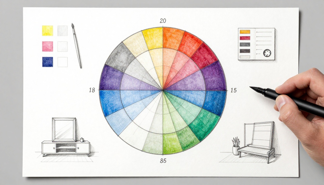
The color wheel changes that. It’s a simple round chart that arranges colors in a circle. This setup shows how hues relate and blend for balance. Artists grab it for paintings. Designers pick palettes with it. Homeowners match rooms. Even casual folks use it to avoid ugly clashes.
You gain confidence in color choices fast. This post covers the basics, history, structure, schemes, everyday uses, and 2026 tools. You’ll see why it works across fields. Ready to spin the wheel?
The Fascinating History of the Color Wheel
Isaac Newton kicked things off in 1666. He shone white light through a prism. The beam split into a rainbow spectrum. Newton bent that spectrum into a circle. This formed the first color wheel. His work proved light holds all colors.
Earlier thinkers laid groundwork. Aristocles Forsius sketched a wheel in 1612. Tobias Mayer refined it in 1758. Johann Wolfgang von Goethe added emotion in 1810. He linked colors to feelings, like red for passion. Albert Munsell upgraded it in 1905. He made a 3D model with hue, value, and chroma.
Artists shifted from light to paint. They used red, yellow, blue as primaries. This RYB model rules mixing today. Colors act like musical notes. Place them right, and harmony sings. Misplace them, and it jars.
Newton’s prism experiments still inspire. For details on his role, check Sir Isaac Newton’s Influence on the Color Wheel.
Knowing this history builds respect. You see the wheel as a tool refined over centuries. It bridges science and art. Next, let’s unpack its parts.
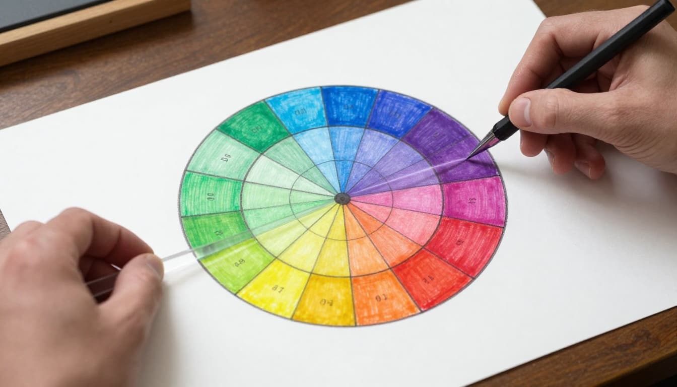
Breaking Down the Color Wheel’s Core Structure
Picture a clock face with 12 hues. They flow smoothly around the edge. This circle beats a straight rainbow line. Opposites pull focus. Neighbors blend easy.
Primaries start it all: red, yellow, blue. You can’t mix these from others in paints. They sit evenly spaced, like pillars.
Secondaries come next. Mix two primaries for each. Red plus yellow makes orange. Yellow plus blue yields green. Blue plus red creates purple.
Tertiaries fill gaps. They blend primary and secondary. Red-orange sits between red and orange. Yellow-green links yellow and green. This creates smooth shifts all around.
Primary Colors: The Building Blocks
Red energizes. Yellow brightens. Blue soothes. These form the base in subtractive mixing, like paints or prints. Screens use additive RGB: red, green, blue light.
Think of primaries as color ABCs. Kids learn them first for good reason.
Secondary and Tertiary Colors: Mixing Magic
Mix equal primaries for bold secondaries. Add more of one for tertiaries. Red-orange needs extra red. The wheel guides ratios.
Complements sit opposite. Red faces green. They boost each other. For more on wheel basics, see the color wheel entry on Wikipedia.
This structure helps you spot relations quick. You read harmony at a glance.
Color Schemes That Make Your Projects Pop
Grab groups from the wheel for instant palettes. Each scheme sets a mood. Pick based on your goal.
Monochromatic uses one hue’s shades. Blues from light sky to navy feel calm. Great for focus.
Analogous takes neighbors. Blue, teal, green flow together. They suit nature scenes.
Complementary pulls opposites. Yellow and purple vibrate. Use sparingly for punch.
Triadic spaces three evenly. Red, yellow, blue bring balance and energy.
Tetradic pairs two complements. Red-green with blue-orange adds vibrancy. Anchor with neutrals.
Examples abound. A blue monochromatic bedroom looks spacious. Red-green screams holidays.
Monochromatic and Analogous for Easy Harmony
Shades of blue make rooms feel bigger. Navy-teal-green outfits look put-together. These soothe because they blend soft.
Complementary, Triadic, and Tetradic for Drama
Yellow-purple walls pop bold. Red-yellow-blue logos energize. Tetradic schemes need gray to tame.
For scheme ideas, explore this guide to the color wheel. Schemes turn guesswork to pro results.
Real-World Ways to Use the Color Wheel Every Day
Start with a dominant hue. Build from there. The wheel prevents clashes.
Painters love analogous for landscapes. Blues and greens mimic sky and trees. Complements add focal pop, like a red barn in fields.
Graphic designers grab complements for buttons. They draw eyes. Modern web sites stick to monochromatic for clean looks.
Fashion folks mix analogous daily. Navy, teal, denim pants pair smooth. Triadic adds scarf pop.
Interiors shine with schemes. Monochromatic walls expand space. Tetradic rugs and pillows layer interest. Neutrals ground it.
In March 2026, trends favor earthy tones. Muted teals calm homes. Dusky pinks warm graphics. Muddy greens suit fall outfits.
In Art and Painting Projects
Layer analogous washes for sunsets. Dot complements for flowers that leap.
Graphic Design, Fashion, and Home Decor
Web palettes use mono earth tones. Triadic accessories spice clothes. Tetradic rooms mix mauve walls with olive sofas.
You create cohesion fast. Results look thoughtful.
Best Digital Tools and Fresh 2026 Trends
Free apps make wheels digital. Adobe Color spins schemes from photos. Coolors generates palettes with AI. It favors 2026 earthies like terracotta-sage.
Canva’s wheel sits in templates. Drag to build. Figma plugins add AR previews.
Khroma crafts custom sets. Input likes, get matches.
Trends push accessibility. High-contrast pairs meet standards. AI pulls from images. Sustainable picks tie to low-VOC paints.
Try this: Upload a photo to Coolors. Export hex codes. For top picks, see 2026 color palette tools.
These speed your work. Updates keep them fresh.
The color wheel equips you with structure, schemes, and real uses. Tools make it simple. Experiment today with Adobe Color or Coolors.
Your project gains polish. Share a photo of your palette in comments. What scheme will you try first? Your next great design starts with one spin.