Picture this. You stand in your dream room, paintbrush ready. Do you pick sunny yellow for the walls, or serene blue? One choice sparks energy. The other brings calm. Why does that happen?
Warm and cool colors shape how spaces feel. Warm ones include reds, oranges, and yellows. They mimic sun and fire. Cool ones cover blues, greens, and purples. Think sky and water. Knowing what are warm and cool colors explained simply helps you decorate homes, paint art, or design outfits. You avoid mistakes. Rooms turn cozy or fresh.
You will find easy breakdowns here. Real examples show differences. Mood effects guide choices. Mixing tips work for beginners. Plus, 2026 trends fit modern tastes. Let’s break it down like a chat over coffee.
Warm vs. Cool Colors: Your Quick Guide to Telling Them Apart
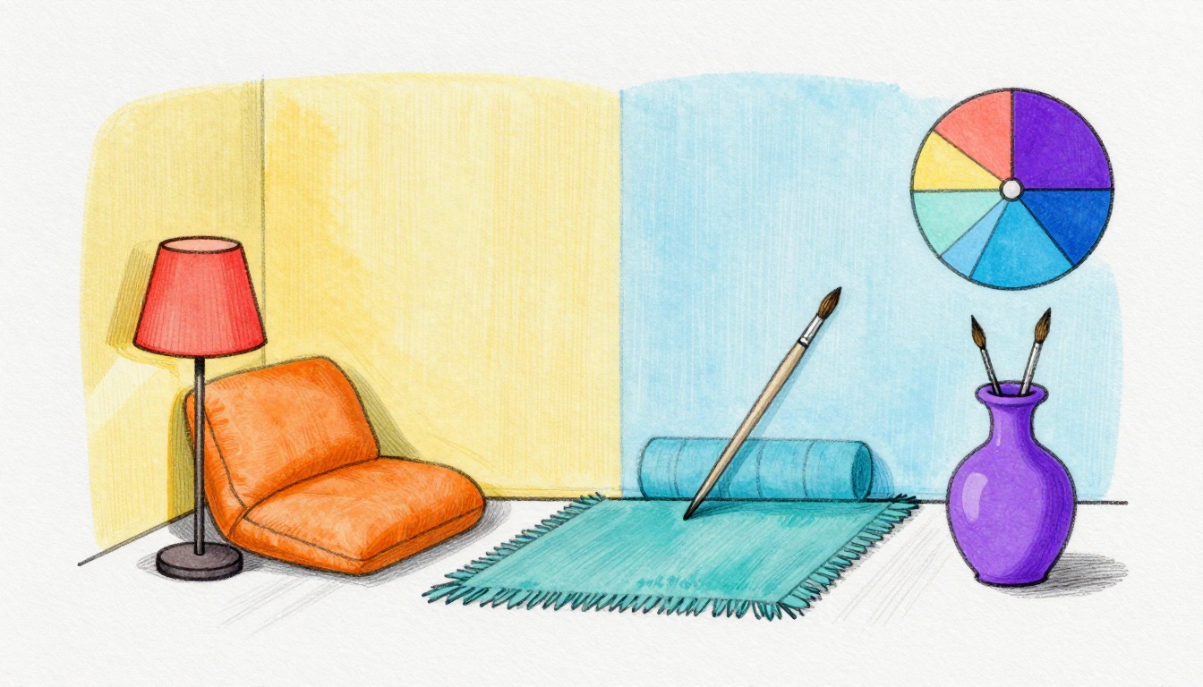
Warm colors come from the red-orange-yellow side of the color wheel. They feel lively, like flames dancing. Cool colors sit on the blue-green-purple side. They relax, like a shady spot by the sea. Every hue has a bias. A red with orange lean feels warmer than one with purple.
Colors trick our eyes based on temperature. Warm pull forward. Cool push back. For a clear split, check this table of examples.
| Warm Colors | Cool Colors |
|---|---|
| Cadmium red | Magenta |
| Sunset orange | Turquoise |
| Golden yellow | Hooker’s green |
| Yellowish green | Lemon yellow |
Warm hues glow like a campfire at dusk. Cool ones shade like forest leaves after rain. Designers use this split for balance. Artists build depth. Next, see warm colors in daily life.
Everyday Examples That Make Warm Colors Pop
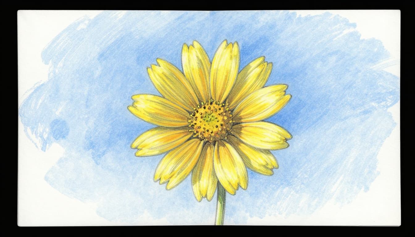
Spot warm colors everywhere. Fire-engine red shines on apples. It grabs attention right away. Sunset orange fills pumpkins in fall. School bus yellow waves from the road. Fall leaves in red-brown piles crunch underfoot.
Burnt sienna warms brick houses. Sap green hints at new grass shoots. These tones advance. They seem closer and bigger. Eyes lock on them first. A warm red apple jumps out against green grass. Sunset skies paint evenings bold.
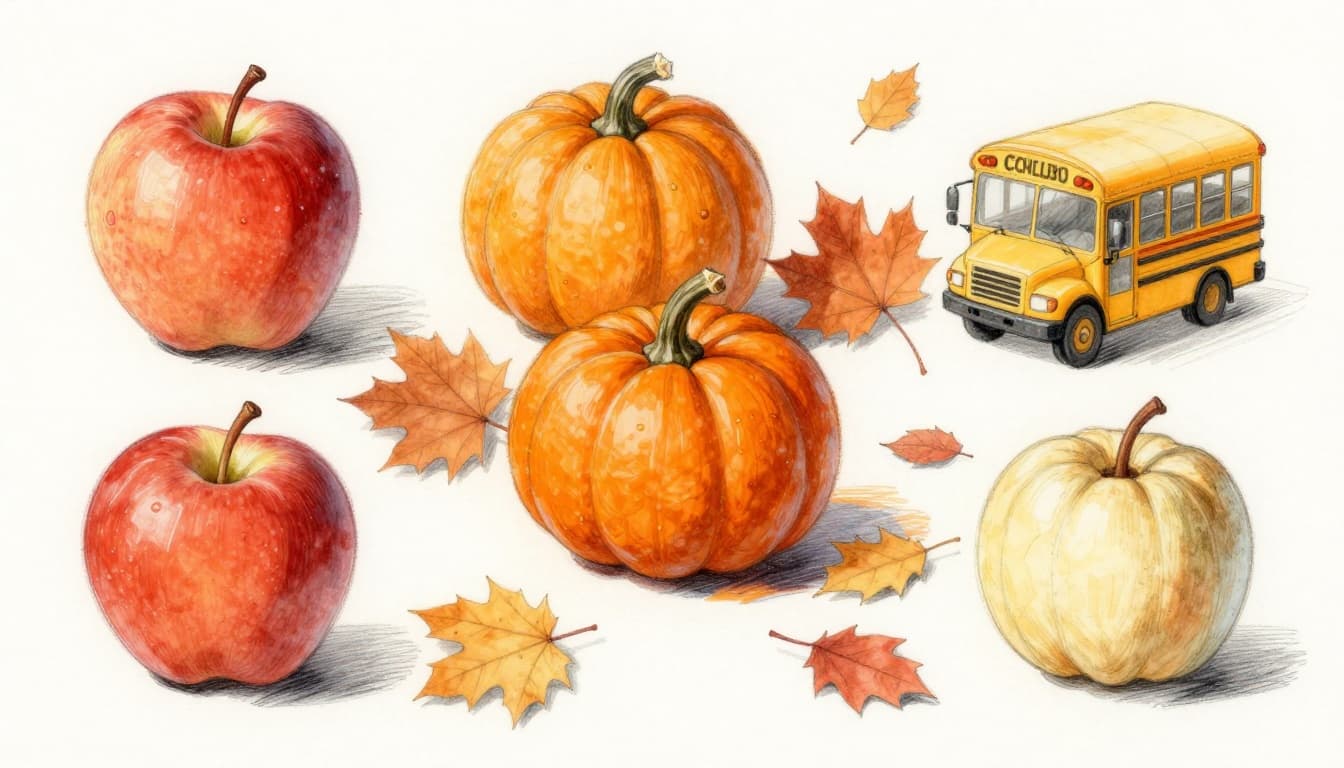
Browns with yellow undertones cozy up leather chairs. They make rooms feel full. In short, warm examples pop because they mimic heat sources.
Spotting Cool Colors That Recede into the Background
Cool colors hide a bit. Pure navy blue mirrors ocean depths. Sky blue stretches horizons wide. Pine green cloaks trees in woods. Lavender softens flower beds.
These hues recede. They feel farther off and smaller. A cool blue wall shrinks a room. Greenish lemon yellow fades next to bold reds. Ocean waves roll back in memory. Leafy forests blend into distance.
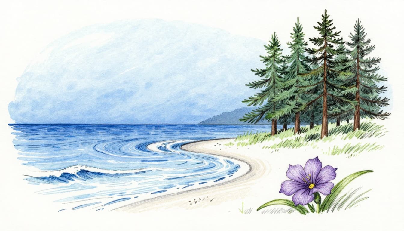
Magenta reds with blue lean stay subtle. They backdrop without stealing focus. Everyday cool ties ground calm scenes. You sense space expand.
For more on basics, check this guide to warm vs cool color temperature.
How Warm Colors Energize and Cool Colors Soothe Your Mood
Warm colors lift spirits. Reds and oranges spark cheer. They fit lively chats around a dinner table. Picture a sunny picnic. Yellows boost excitement. Yet too much overwhelms, like a fire out of control.
Cool colors ease tension. Blues promote focus. Greens relax like a park bench. Purples whisper peace. A beach day under blue sky chills you out. Excess cool feels distant or blue, though. Think empty night skies.
Balance works best. Mix them for harmony. Studies show warm hues raise heart rates a touch. Cool ones slow them. In homes, warm dining areas invite talks. Cool bedrooms aid sleep.
One family painted their kitchen soft orange. Guests stayed longer. Another chose light blue office walls. Work flowed better. Color psychology details back these effects. Mood shifts happen fast with smart picks.
The Eye Tricks: Why Warm Colors Jump Forward and Cool Fade Back
Eyes see warm colors advance. Reds and yellows pop closer. They grow larger in view. Cool blues recede. Greens shrink to backgrounds. This optical play stems from nature cues. Sun warms. Shadows cool.
Place yellow next to blue. Yellow warms up more. Blue cools down. Simultaneous contrast amps it. A warm stroke over cool base grabs stares. Cool over warm blends soft.
Try this at home. Grab paper swatches. Put red by blue. Red leaps ahead. Blue drops back. Art uses this for illusions. Landscapes gain miles with cool hills far off.
Designers shrink big rooms with cool tones. They expand small ones with warm. Relative terms matter. A peachy beige warms beside gray. Knowledge like this saves paint regrets.
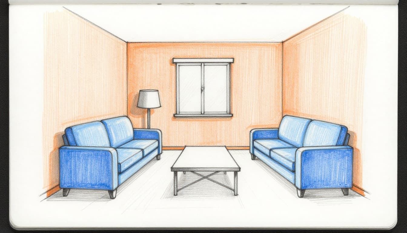
Easy Ways to Mix Warm and Cool Colors in Your Home or Art
Start with ratios. Use 60% cool for bases. Add 30% warm neutrals. Pop 10% warm accents. This keeps balance. Test samples in your light. Color wheels show matches.
In homes, warm kitchens invite cooks. Soft orange walls energize. Cool bedrooms soothe with pale blues. Art follows suit. Warm foregrounds draw eyes. Cool backgrounds add depth.
Neutrals split too. Yellow-beige warms. Blue-gray cools. Context decides. For tips on blending in decor, see this mixing guide.
Transforming Rooms with Balanced Interiors
Cozy living rooms mix cool gray walls with terracotta pillows. Warm wood shelves hug the space. Serene offices pair green plants against warm desks. Lighting boosts warms under bulbs. They glow inviting.
Avoid all-warm pitfalls. Rooms feel tight. One client skipped cool bases. Her space screamed. Balance fixed it fast.
Creating Depth and Drama in Your Art Projects
Paint yellow flowers on blue skies. Warm pops forward. Cool skies recede for miles. Landscapes thrive this way. Cool distant hills meet warm fields.
Try a split canvas. Half warm close-up. Half cool far-off. Biased mixes build realism. Beginners nail vibrancy quick.
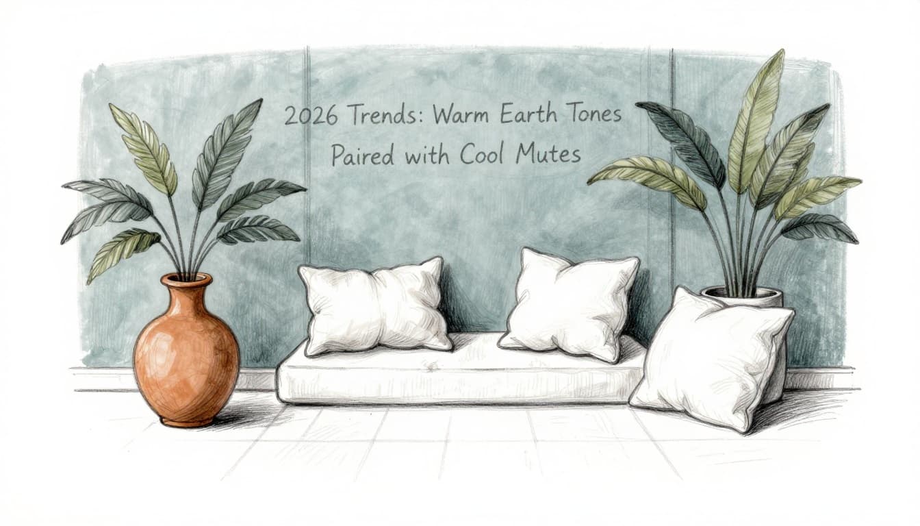
2026 Trends: Warm Earth Tones Paired with Cool Mutes
Warm earth tones lead 2026. Terracotta and mustard warm souls. Muted blues and greens cool them. Think sage walls with ochre vases. Hygge vibes post-pandemic crave this balance.
Designers layer dusty teals over warm neutrals. Forest greens pair with clay reds. Homes feel nature-hugged. Abstracts glow in liquid gold warms against misty cools.
Sustainable picks shine. One trend room tosses terracotta pillows on blue-green bases. Plants tie it. Earthy palette insights predict cozy rises.
Ready to Play with Warm and Cool Colors?
Warm colors energize and advance. Cool ones calm and recede. Balance them for standout spaces or art. Experiment turns flat to fab.
Start small. Test swatches in your room. Paint a canvas split. Refresh one wall. Share your project in comments. What warm or cool shift wows you? Pin this for later.
FAQ
Can gray be warm or cool? Yes. Check undertones. Yellow-gray warms. Blue-gray cools. Light matters too.