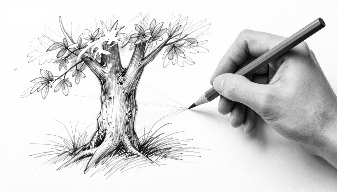
Ever notice how a quick sketch of a tree looks lifeless? Flat lines make it seem stiff, like a cartoon without soul. Line quality changes that. It covers the thickness, smoothness, texture, and shifts in lines that bring weight, movement, light, and feel to your drawings.
Good lines make art pop off the page. They grab eyes and tell stories. You will see what builds strong lines, why they create depth, traps to dodge, and easy fixes.
What Makes Up Great Line Quality in Your Drawings
Line quality shapes how lines look and act on paper. Artists vary thickness, smoothness, value, texture, direction, and shape. These choices stop drawings from feeling dull.
Think of lines like voices in a story. Thick ones shout power. Thin ones whisper detail. Rough edges scratch like bark. Smooth flows like silk. Variation keeps viewers hooked.
For more on the basics, check RapidFireArt’s introduction to line quality.
Mastering Line Weight: Thick for Strength Thin for Detail
Line weight means thickness. It shows strength in shadows or heavy spots. Use thick lines there. Go thin for light areas, details, or far objects.
Press harder with pencil for bold marks. Ease up for fades. On an apple, fat dark lines at the bottom add roundness. Top edges stay light and slim.
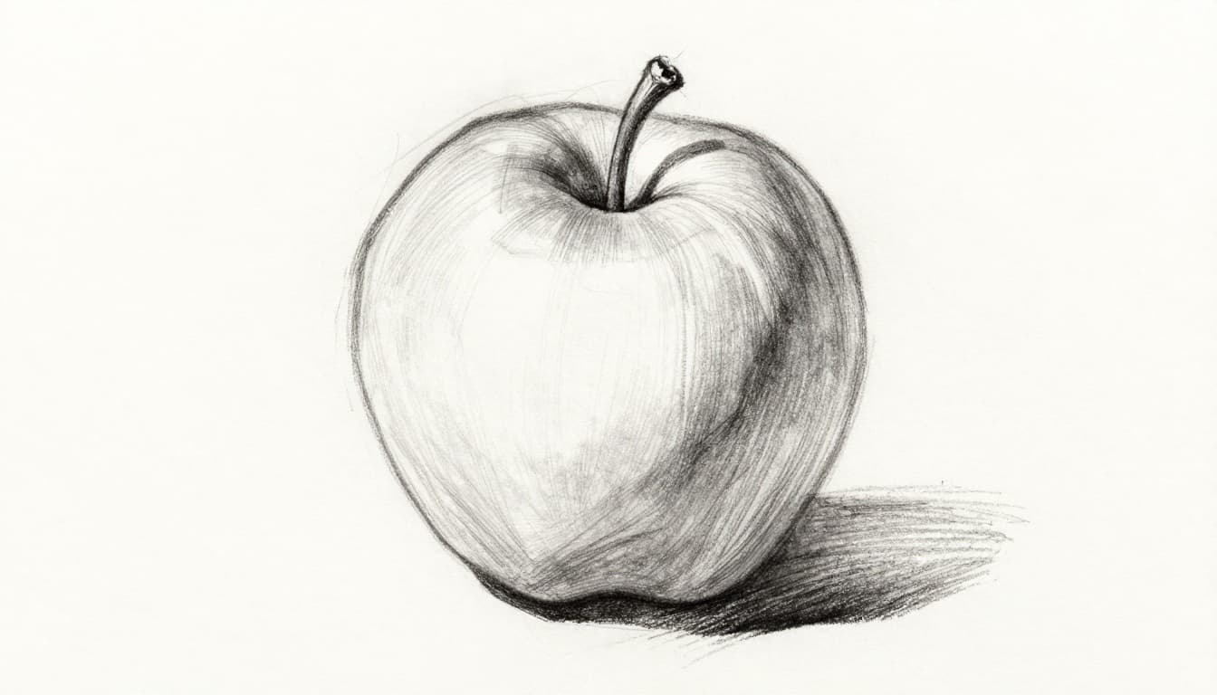
This trick builds form fast. Shadows hug curves. Highlights lift shapes.
Smooth vs Rough Lines: Capturing Texture Perfectly
Smooth lines suit soft things. Flowing strokes fit silk or skin. Rough ones grab grit, like fur or rock. Jagged marks add bite.
Value helps too. Dark thick lines for deep shadows. Light thin for glows. Wavy lines mimic water. Dots suggest fur from afar.
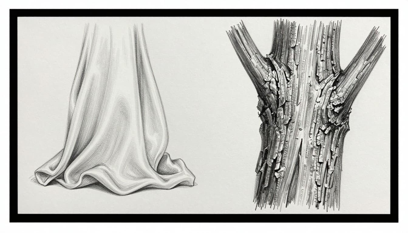
Match lines to what you see. Texture comes alive. Subjects feel real.
Line Variation and Direction: Adding Flow and Energy
Shift thickness, texture, and path as you draw. It guides eyes and hints at motion. Straight sharp lines show edges. Curved loose ones soften mood.
Thick to thin creates swell. Directions wrap forms in 3D. A running figure needs sweeping strokes for speed.
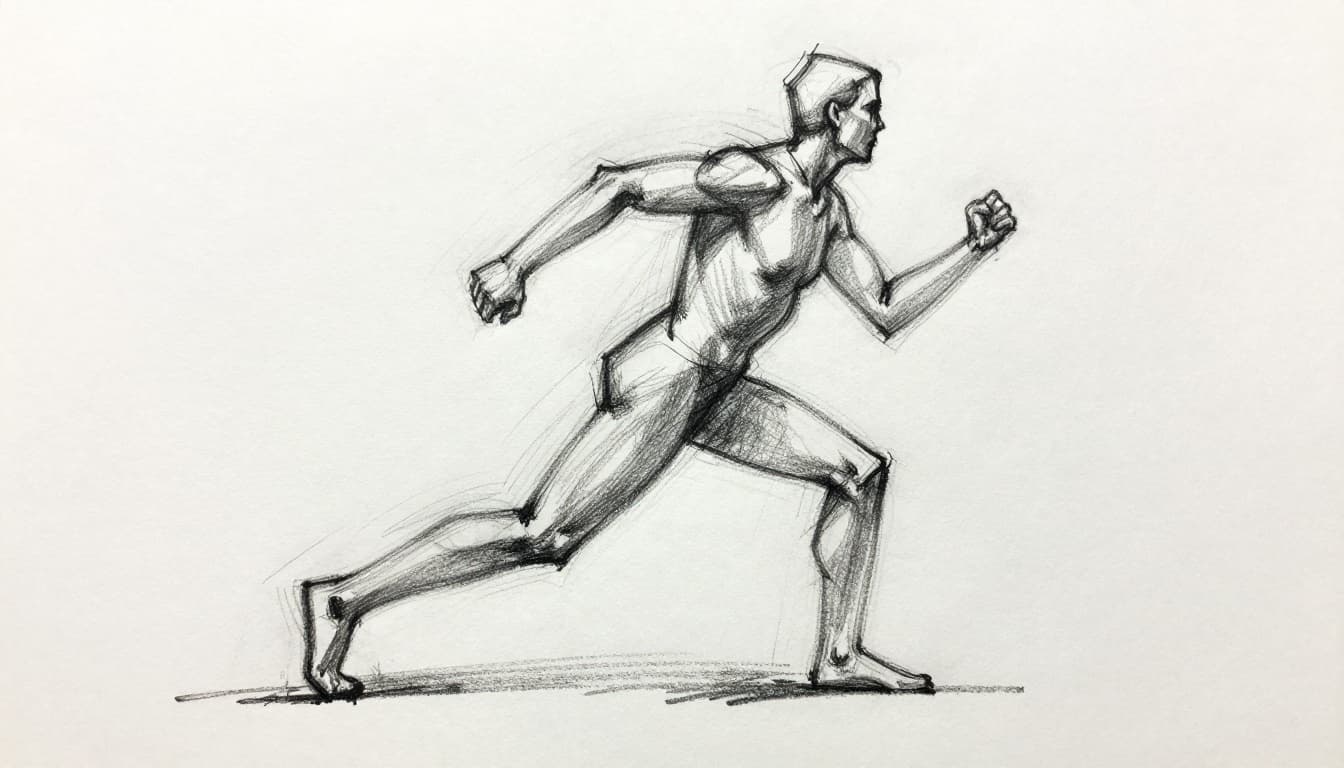
Energy flows. Drawings breathe.
Why Line Quality Turns Flat Sketches into Stunning Art
Varied lines add layers. They build depth, texture, light, weight, and mood. Viewers linger because eyes follow natural paths.
Stiff sketches bore. Lively ones pull you in. Good lines express feeling. They make simple marks powerful.
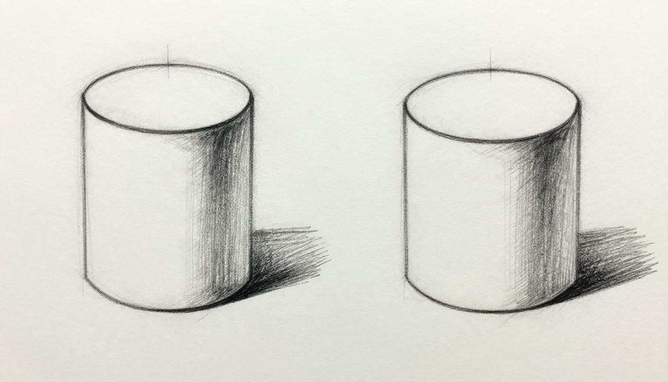
Building Depth and Realistic Form
Uniform lines flatten shapes. Vary them for illusion. Thick dark in shadows. Thin fading for distance.
A cylinder gains roundness with swelling sides. Cubes pop with edge weight. Forms lift off paper.
Depth fools the eye. Art feels solid.
Conveying Mood Texture and Movement
Bold lines scream power. Delicate ones whisper calm. Rough adds grit. Gesture strokes capture swing.
Match real textures for trust. Water ripples. Wind bends grass. Mood shifts with each stroke.
Drawings immerse. They move and touch.
Common Line Quality Traps Beginners Fall Into
New artists repeat mistakes. Uniform lines kill spark. Fix them quick with small changes.
Spot issues early. Adjust on the spot.
Sticking to One Line Thickness Everywhere
Same weight everywhere bores. No focus or depth. Light stays bold. Shadows fade.
Vary on purpose. Thick for near and dark. Thin for far and light. Depth returns.
Drawing Stiff Mechanical Lines Without Life
Robot lines ignore light. Uniform texture lacks feel. Subjects seem dead.
Loosen your grip. Watch real forms. Let hand flow. Life sparks.
Simple Techniques to Level Up Your Line Quality Fast
Start small. Practice pressure, tools, and habits. See gains quick. In March 2026, digital trends favor wobbly, hand-drawn lines for real feel. Scan paper sketches or use apps with grain brushes.
Build step by step. Daily shapes help.
Vary Your Pressure for Natural Thick-Thin Lines
Press firm for thick dark. Lift for thin light. Trace contours around objects.
Apples round up. Cylinders swell. Form builds easy.
Pick the Right Tools for Different Line Feels
Pencils give smooth control. Ink sets sharp edges. Charcoal smears texture.
Digital shines now. Procreate brushes add grain. Sketchbook’s steady stroke smooths wobbles. See Sketchbook’s tips on smooth strokes. Or try 2026 apps for AI line tweaks, like those beating Lazy Nezumi for natural flow.
Tools match needs. Lines improve.
Build Gesture and Contour Habits for Fluid Lines
Quick gestures catch motion. Slow contours hug form. Fade thin for mist.
Match to subject. Fog drifts light. Rock bites rough. Habits stick.
Line quality defines your drawings. It adds life, depth, and feel. Skip uniform traps. Vary weight, texture, and flow.
Grab a pencil now. Try thick-thin on one shape. Watch it transform. Share your before and after. You got this.