You’ve spent hours on a drawing. The lines feel right. But the shading? It looks lifeless, like a cardboard cutout stuck on the page. Flat shading happens when lights and darks mush into dull mid-tones. No depth. No form. Just blah.
This issue hits beginners hard. Yet pros face it too, in pencil sketches, oil paints, or digital layers. Weak contrast kills volume. Harsh edges block smooth transitions. Forgotten light rules leave shadows weak.
Luckily, fixes exist. You can boost values, blend like light wraps real objects, and add key details. These steps work with everyday tools. Your sketches turn from 2D to 3D fast. Let’s spot the problems first, so you nail the solutions.
Spot the Common Culprits Behind Flat Shading
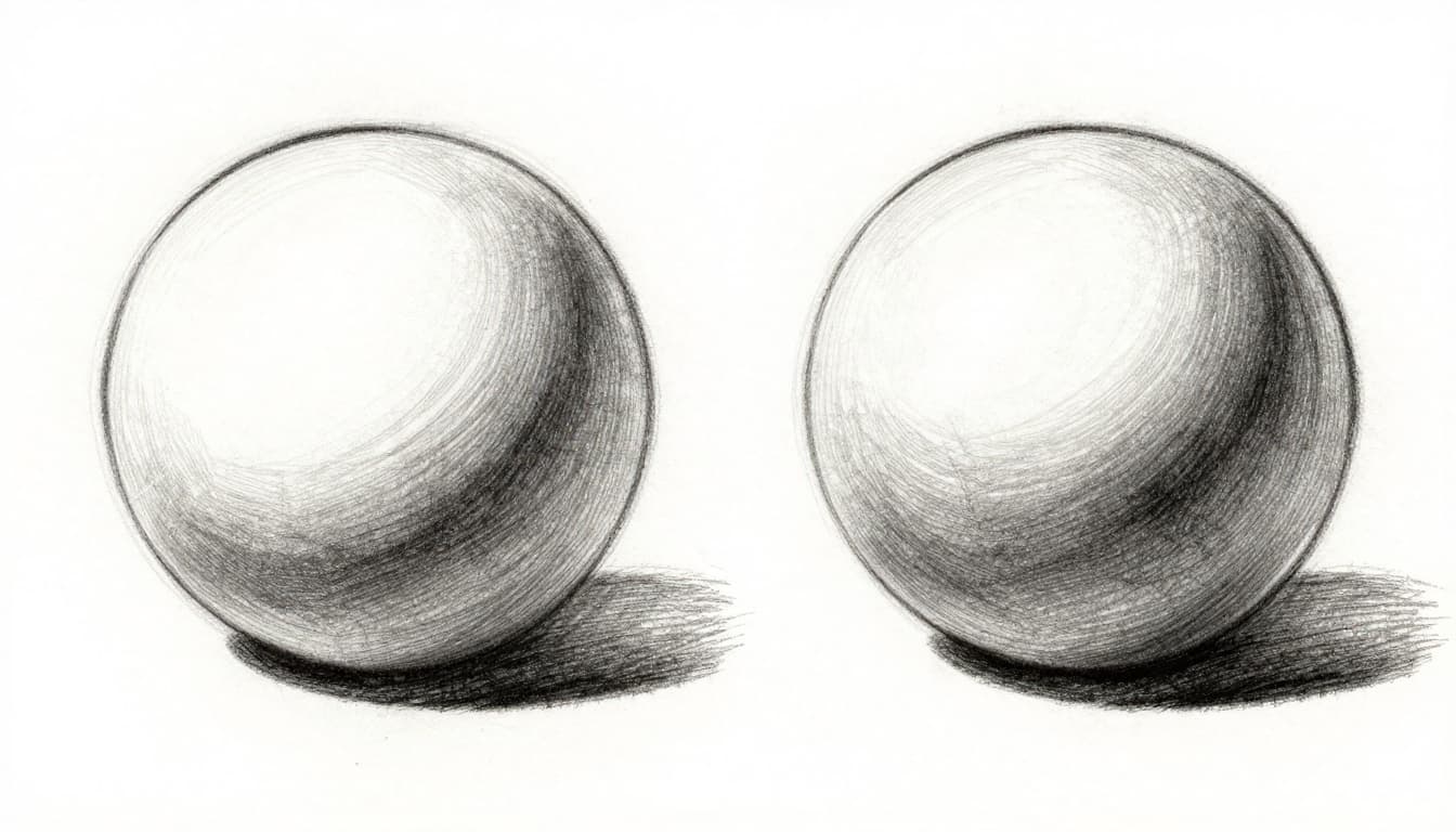
Flat shading sneaks in from simple errors. Artists often miss them until the piece feels off. Think of a sphere. A flat one stays gray overall. A good one glows with bright spots and deep dips.
Three main issues stand out. Each pulls depth away. Fix them, and form pops.
Weak Contrast Keeps Everything in the Middle
Lights dim down too much. Darks lighten up. Everything hovers in gray no-man’s-land. Your art resembles a sticker, not a solid object.
Squint at a photo of a ball under lamp light. Highlights blaze near white. Shadows plunge almost black. Yet drawings shy away from extremes.
For example, a gray-shaded sphere looks flat. Crank lights brighter, darks deeper. Depth appears. This works across pencils, paints, or Photoshop. Test it: print your art. Squint hard. If values blend, contrast lacks.
Artists like Dorian Iten explain common shading mistakes that lead here. Check his tips for quick insights.
Harsh Jumps Instead of Smooth Light Wrap
Light bends around forms in real life. It fades gradually from bright to dim. But hard lines or blocky brushes create jumps. Shadows hit like walls.
Pencil strokes stay sharp. Digital hard brushes smear edges wrong. Result? No wraparound feel. The form stays boxy.
Practice on circles. Draw a value scale first. Then gradient a ball. Soft shifts build roundness. Harsh ones flatten it.
Forgetting Shadows, Highlights, and Light Rules
Core shadows define turns from light. Highlights catch direct rays. Cast shadows fall away. Reflected light bounces back softer.
Skip these, and chaos rules. Folds in cloth look muddy without 3-5 values per crease. Pick one light source. Stick to it.
A face under side light needs crisp jaw highlight. Soft cheek shadow. Consistent rules make it breathe.
Quick Checks to Diagnose Your Flat Spots
Before fixes, spot issues fast. These tests reveal flatness in seconds. No fancy gear needed.
First, flip your canvas. In Photoshop or Clip Studio, hit the flip button. Upside-down art shows value problems clear. Edges that popped now blur.
Next, desaturate colors. Grayscale strips hue distractions. Weak values jump out. Use phone photo editors for prints.
Squint or step back ten feet. Mid-tones mush. True lights and darks hold.
Mirror view works too. Hold paper up. Reversed image tricks your eye into fresh checks.
Digital bonus: adjust levels. Pull sliders in Photoshop. Histogram spikes show poor range.
Try these now. Pick one drawing. Run all four. Flat spots glow like neon.
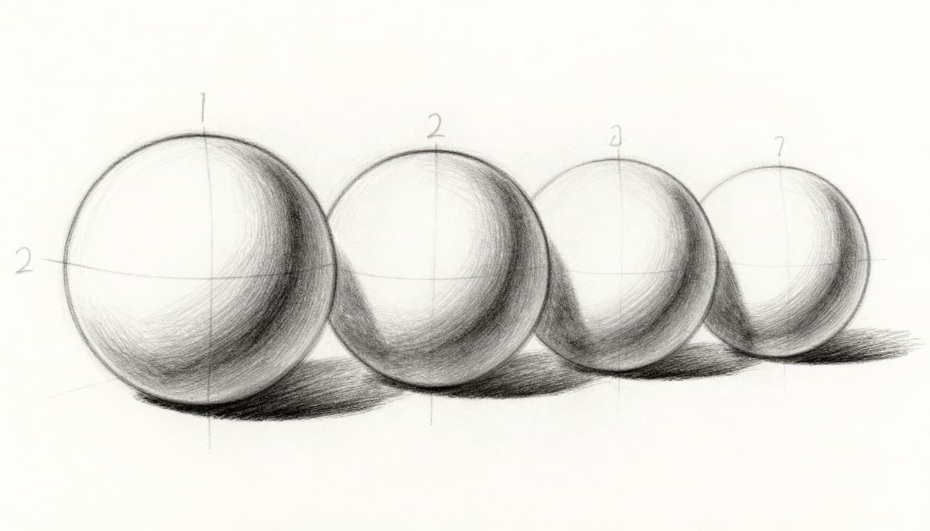
Build Real Depth: Step-by-Step Shading Fixes
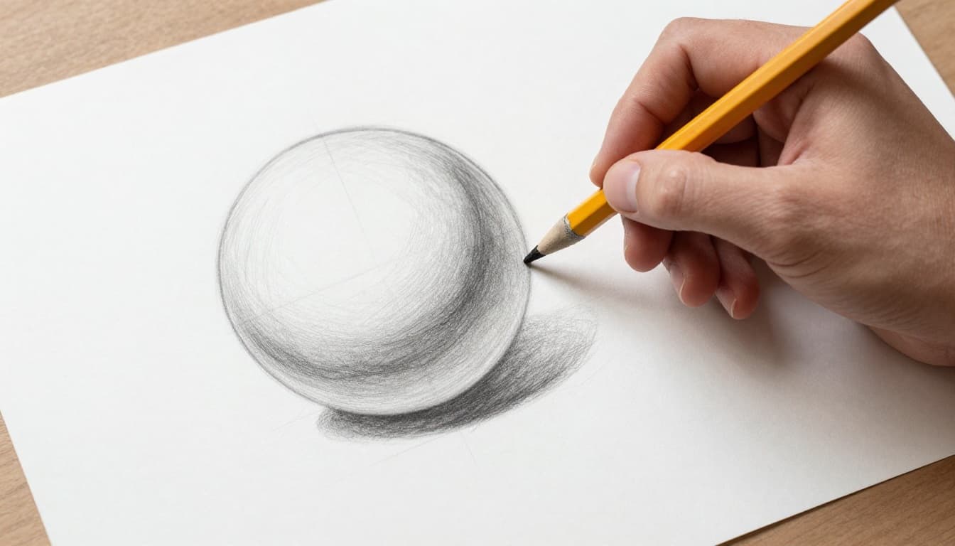
Ready to fix? Layer changes gradually. Start basic. Build up. Use spheres for practice. They teach form fast.
Push Your Lights Brighter and Darks Deeper
Contrast builds the base. Lights hit near paper white. Darks near black.
Test with a photo first. Does it have punchy values? Match that.
Layer darks light at first. Build density. Step back often. Check from afar.
Practice value scales daily. Go from white to black in seven steps.
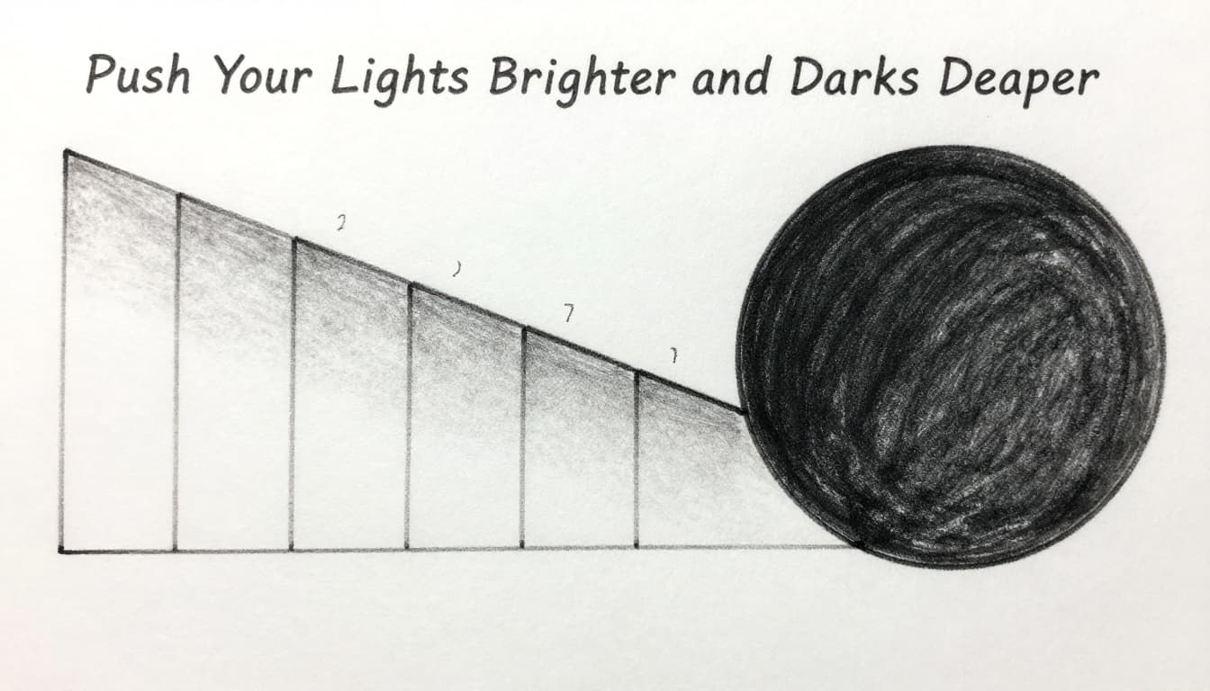
This exercise trains your eye. Soon, flats vanish.
Blend for Smooth Modeling That Pops
Map the light path. Start at highlight. Fade to core shadow. Add reflected light below.
Traditional? Use tortillons or fingers. Rub gently. Keep direction consistent.
Digital? Soft airbrushes or smudge tools. Low opacity layers prevent mud.
Here’s a quick flow:
- Outline form lightly.
- Block highlight and core shadow.
- Blend mid-tones smooth.
- Refine edges later.
Spheres like this make blending click.
Layer in Realism Boosters Like Edges and Shadows
Now add polish. Crisp edges on lit rims. Soften shadow edges. Cast them long.
Reflected light lifts darks slightly. Fabric folds shine here. Use 3-5 values per crease. Imply color shifts with tone.
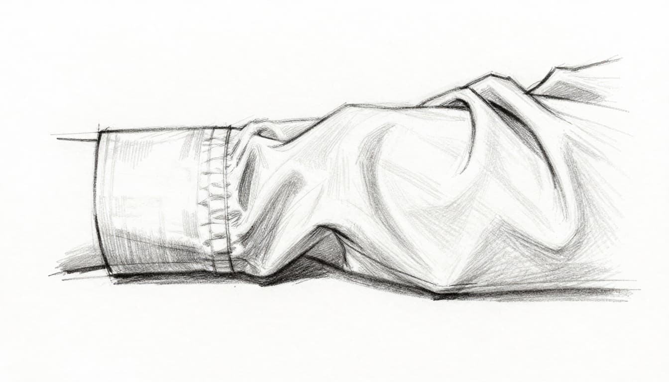
Folds gain life this way. Practice on sleeves or drapery.
Traditional vs Digital: Best Tools for Each
Both mediums shine with right tools. Traditional feels tactile. Digital offers endless undos.
Here’s a quick comparison:
| Aspect | Traditional Tools | Digital Tools |
|---|---|---|
| Contrast Check | Squint, step back, grayscale print | Levels adjustment, desaturate layer |
| Blending | Fingers, tortillons, stumps | Soft brushes, smudge, blur filters |
| Quick Tests | Mirror, flip paper physically | Canvas flip, viewport rotate |
Pencils like 2B-6B build values. Fingers blend fast.
Digital? Pressure sensitivity mimics real marks. See digital shading methods for steps.
In 2026, viewport flips stay key in apps like Clip Studio.
2026 Pro Tips to Supercharge Your Shading
Practice beats theory. Do ten-minute sphere studies daily. Flip canvases mid-way.
AI helps as guides, not crutches. Clip Studio’s AI coloring suggests blends that match your style. Photoshop’s AI brushes adapt to charcoal or oils for smooth shades.
Procreate sticks to basics: grain shaders on clips, alpha lock for pixels. No heavy AI, pure control.
Import AI textures from Midjourney for reference. Then shade by hand.
Canvas flips in apps build habits. Results compound fast.
Ready to Make Your Shading Pop
Contrast, smooth blends, and light rules fix most flats. Push values hard. Wrap light naturally. Add edges and shadows last.
Grab paper or tablet now. Shade one sphere. Use these steps. Watch flatness fade.
Share your before-and-after in comments. What fixed your shading most? Subscribe for more tips. Your realistic forms await. Keep drawing.